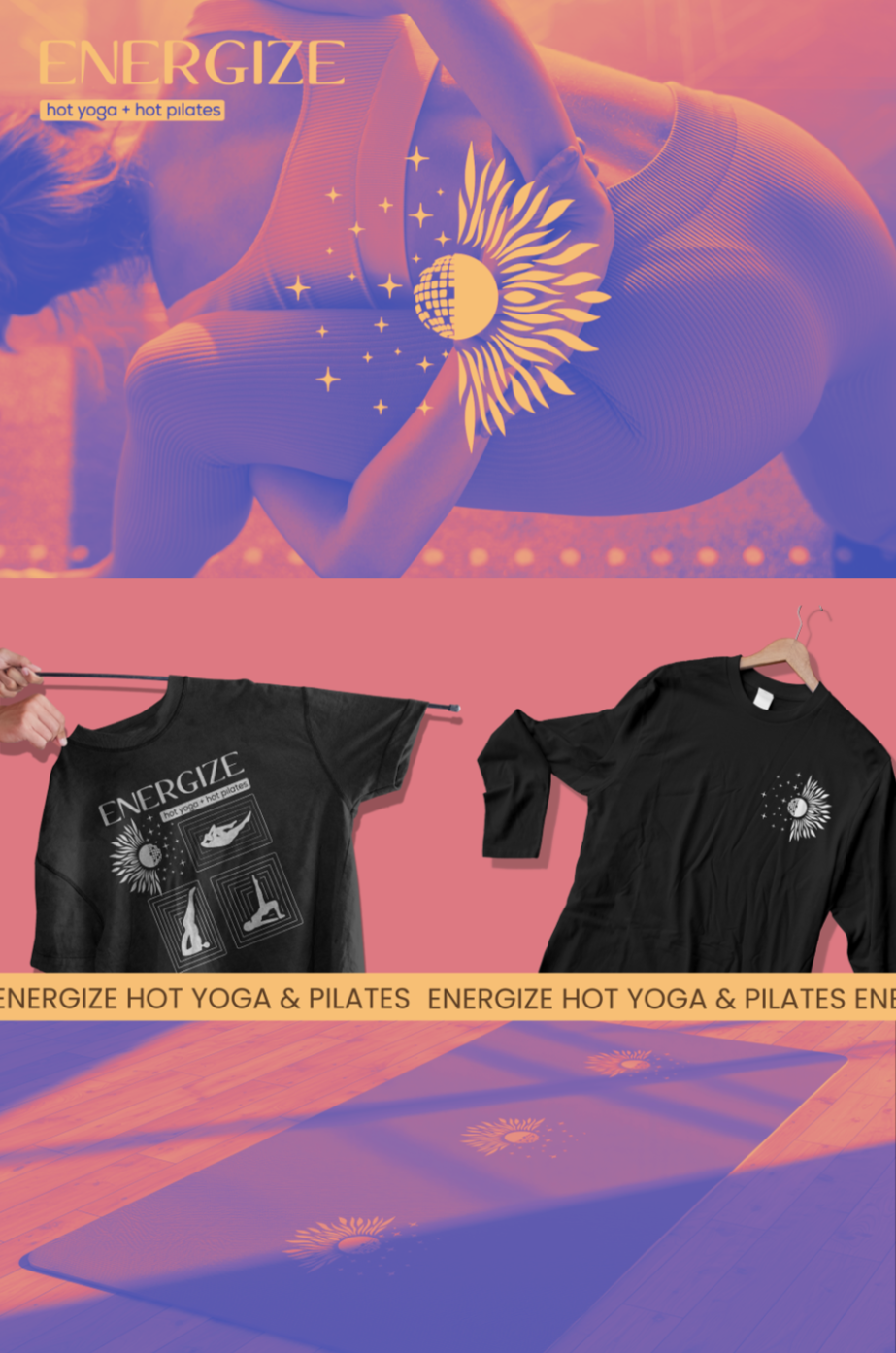
01 Energize Studio
Merchandise Design
Energize Studio came to me with a logo. I gave them a world. This t-shirt design expands their existing brand identity into a full visual language, weaving yoga and pilates poses, mat iconography, and their signature sun mark into a single, cohesive composition. The real brief was atmosphere: disco balls hanging from the ceiling, black lights, glow-in-the-dark stars, a room that feels more like a dance floor than a studio. That energy had to live on the shirt. The result is a design as dedicated to the Energize community as the community is to its practice.
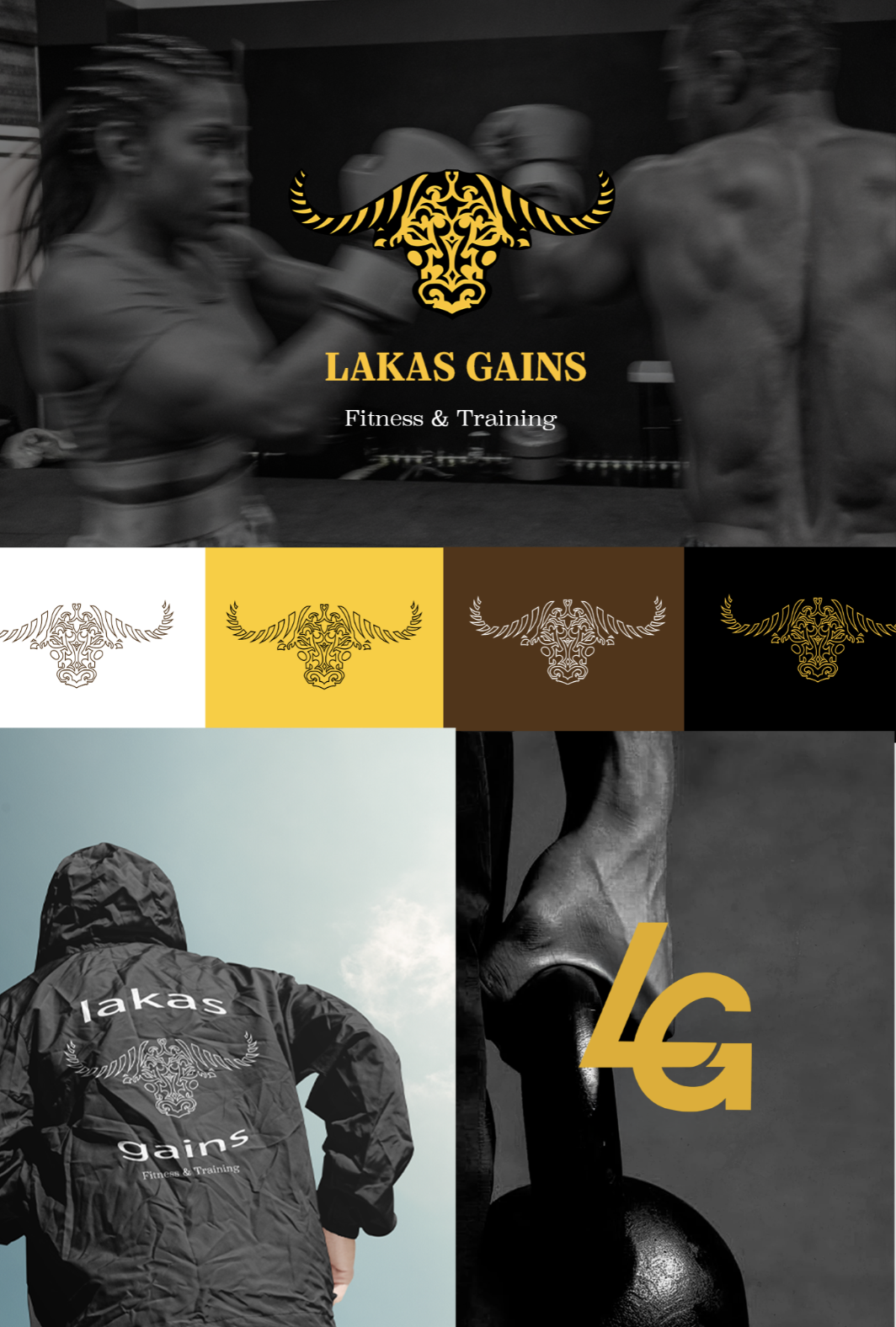
02 Lakas Gains
Logo Design
Lakas came to me with a vision. I gave it a mark. This logo design for his LA-based fitness and personal training brand builds a full visual identity around one powerful idea, the water buffalo, geometric and commanding, crafted into a custom sub-logo that lives seamlessly across branding and merchandise. The brief was strong: something simple, striking, and built to stand out in a saturated fitness market. Drawing inspiration from the LA Rams and the visual language of sports and athletic brands, the logo is as powerful as the name it represents.
03 Surf Skate Flow
Logo Design
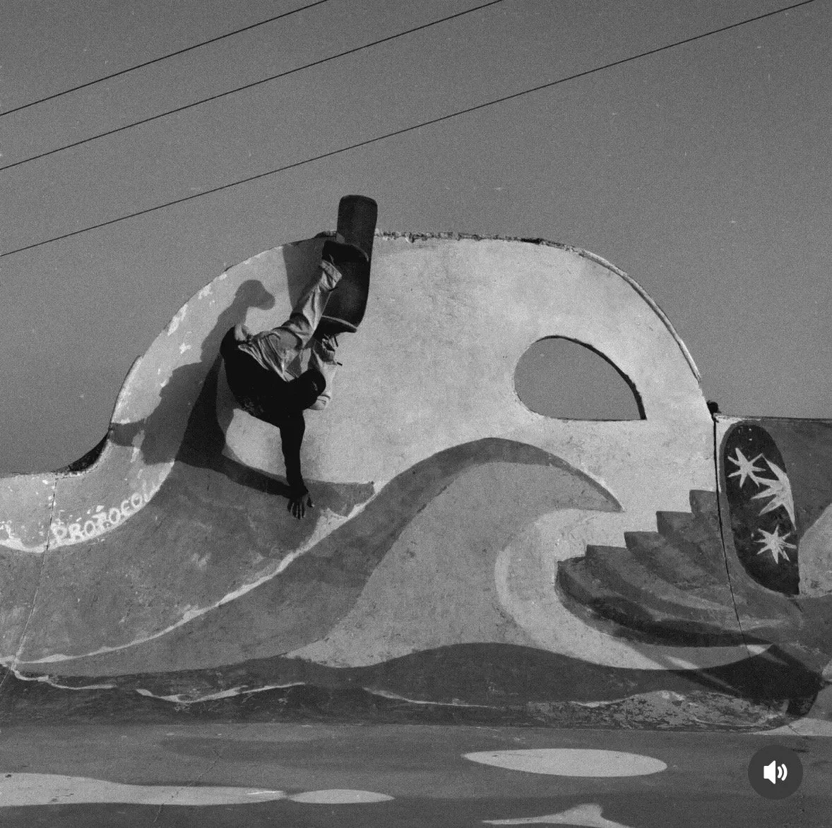
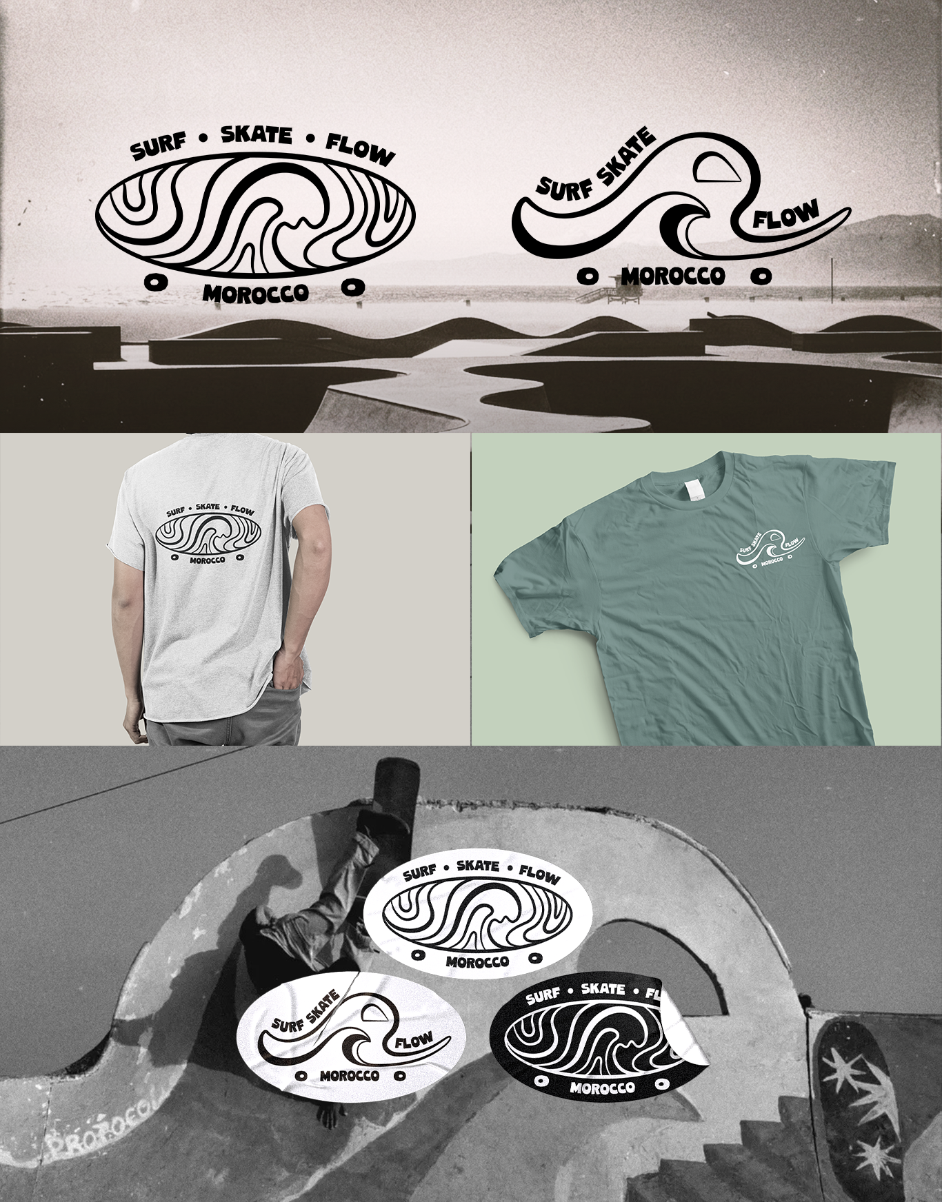
A school with a soul needed a mark to match. Working with Surf Skate Flow out of Taghazout, Morocco, one of the most iconic surf and skate destinations in the world, I built a logo rooted in the place itself. The shape of the skatepark wall lives inside the design, turning the environment into the identity. Two versatile marks, built for flow state and built to travel, websites, socials, stickers, boards, and t-shirts. The result keeps the heart of Taghazout alive everywhere the brand goes.
04 Soberg Custom Builds
Logo Design
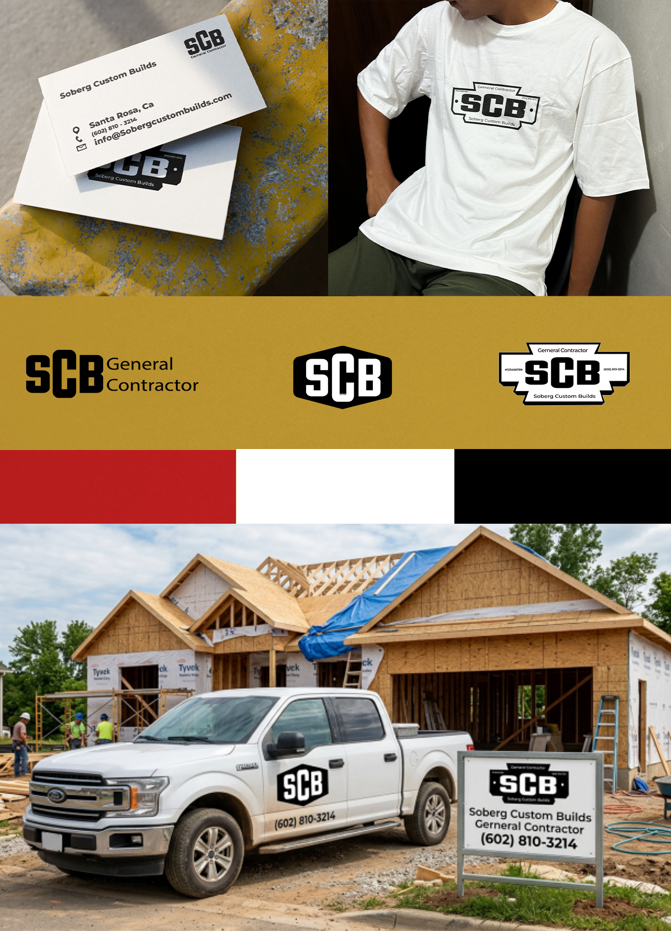
Some companies build structures. SCB builds with intention. Working with Soberg Custom Builds, a family-owned construction company with craft at its core, I created an identity that holds that weight. The mark draws from the materials themselves, strong lines, deliberate form, nothing wasted. Built to live on signage and stationery, workwear, and websites. Wherever the name shows up, it shows up right.
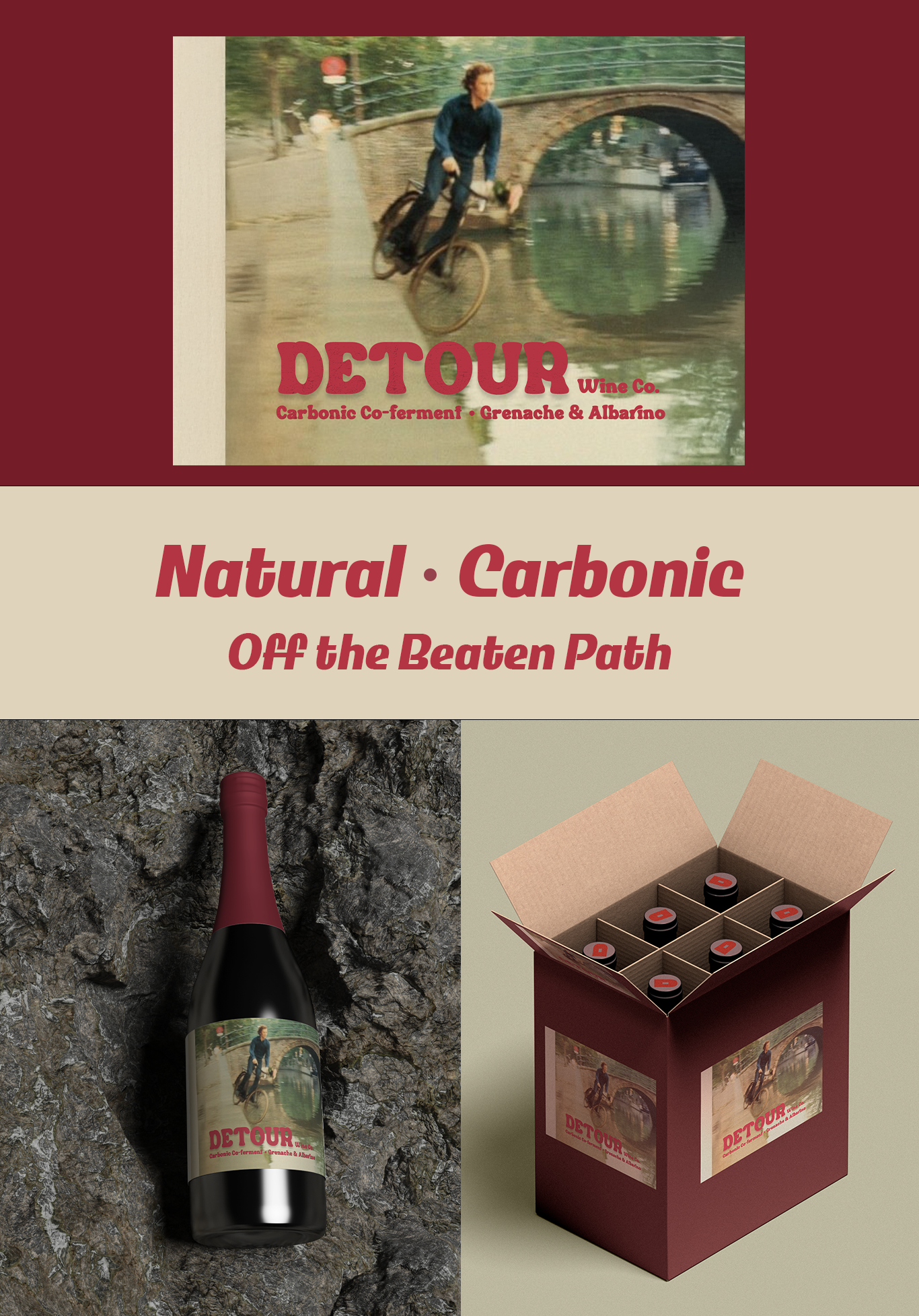
05 Detour Wine Co.
Logo Design
Not all detours are planned. Some are a bicycle, a cobblestone street, and the split second before everything goes into the canal. Detour Wine Co. is a carbonic natural wine that lives in that moment, whole-cluster, low-intervention, gloriously unfiltered. I built a label that matches the liquid inside: a little wild, a lot intentional, and impossible to put down. The kind of wine you bring when you want to be remembered.